Cabinet Color Psychology Without the Overselling
Search for cabinet color psychology and you will find bold claims: blue calms you, red makes you hungry, yellow makes you happy, gray makes you sad. Some of those ideas have a grain of truth, but most are oversold. Your cabinet color will not fix your mood or change how much you eat. What it will do is change how light behaves in the room, how big or cozy the space reads, how much wear shows, and how the kitchen sits with the rest of the house.
This post is for Houston homeowners choosing a cabinet color for a kitchen, bathroom, laundry room or built-in, who want practical guidance without the hype. We look at what color actually does in a room, how common cabinet colors behave in real conditions, and how to test choices before you commit.
As a shop that builds and finishes custom kitchen cabinets for homes across Greater Houston, we see color decisions play out every week. The advice here is about living with a color for years, not just liking it in a photo.
What Cabinet Color Psychology Gets Right and Wrong
Color does influence perception. Lighter colors reflect more light, so a room with light cabinets usually feels brighter and more open. Darker colors absorb light, so the room feels more enclosed or intimate. Warm tones like cream, tan and honey wood tend to read as inviting. Cool tones like gray, blue and crisp white tend to read as clean or calm.
Where the popular claims go too far is in suggesting specific, predictable emotional effects. Reactions to color vary by person, culture, and personal history. A navy island that feels calm to one person feels heavy to another. Research on color and emotion is mixed and highly context-dependent.
A more useful frame is to treat color as a tool for three things:
- Managing light in the room
- Creating contrast or cohesion with other finishes
- Controlling how much wear and dirt shows
If a color does those three jobs well for your space and you like looking at it, it is the right color.
How Common Cabinet Colors Behave in Real Kitchens
White and off-white
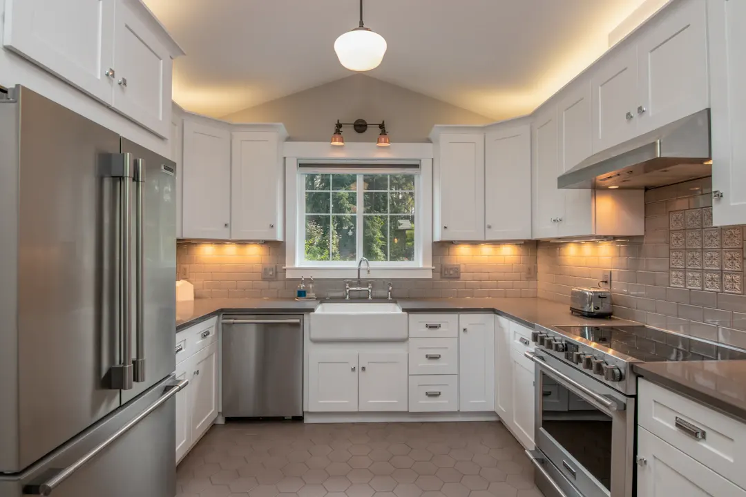
White cabinets reflect the most light and make small or dark kitchens feel bigger. They are flexible with countertops and hardware. The tradeoffs are that they show smudges, scuffs and yellowing from cooking grease near the range, and pure bright whites can look stark under cool LED lighting. Softer off-whites with a touch of warmth tend to feel more comfortable over time.
Gray
Gray became a builder default across many Houston subdivisions, which is part of why some homeowners now find it flat. Gray works best when it has a clear undertone, warm (greige) or cool (blue-gray), chosen to match the floor and countertop. Mid-gray hides wear well.
Blue and navy
Navy and deep blue are popular for islands and lower cabinets. They add depth without the starkness of black and pair well with white or wood uppers. Lighter blues read airy and casual, which suits coastal homes in Galveston and Brazoria counties. Very dark blue shows dust and fingerprints on matte finishes.
Green
Sage, olive and deep green have grown in popularity. Muted greens connect well with natural wood and brass hardware and feel warmer than gray. Like blue, they are easy to love and slightly riskier to resell, so many homeowners use green on a single zone.
Black and charcoal
Black cabinets look dramatic and modern but show dust, water spots and fingerprints. They also absorb light, so they need strong task lighting. Charcoal is a softer alternative.
Natural wood tones
Stained oak, walnut, maple and cherry bring warmth that paint cannot match. Grain hides everyday wear. Wood tones have cycled in and out of fashion, but a well-built wood kitchen tends to age gracefully. For help choosing species, see how to choose wood for custom cabinets.
| Color family | Light in room | Shows wear | Long-term flexibility |
|---|---|---|---|
| Warm white | High | Moderate to high | High |
| Bright white | Very high | High | High |
| Mid gray or greige | Medium | Low | Medium |
| Navy / deep blue | Low | Moderate | Medium |
| Muted green | Medium to low | Low to moderate | Medium |
| Black / charcoal | Very low | High | Lower |
| Medium wood stain | Medium | Low | High |
Light Matters More Than Theory
Houston sun and orientation
Houston gets strong sun, and the direction your windows face makes a big difference. West-facing kitchens get hot, orange afternoon light that warms everything it touches. North-facing kitchens get cooler, steadier light. A gray that looks neutral in a north-facing room may look beige or even pinkish in a west-facing one.
Artificial lighting
Interior bulbs have a color temperature. Around 2700K is warm and yellowish, 3000K is soft white, and 4000K or higher is cool and bluish. Cabinet colors shift under each. Under-cabinet lighting matters too, since it lights the most visible part of your lower cabinets and backsplash. Our under and over cabinet lighting can be specified to match the color temperature of your other fixtures, and our guide on under-cabinet and in-cabinet lighting explains the options.
Finish sheen
Sheen changes color perception as well. Matte finishes look softer and darker but show handprints. Satin is a common middle ground. Semi-gloss is easy to wipe but highlights imperfections in the surface. On custom cabinets, a durable factory-applied or catalyzed finish holds up better to Houston humidity than a brushed latex.
Practical Factors That Should Drive Your Choice
When we help homeowners narrow cabinet colors, we steer the conversation toward practical questions more than feelings.
- How much natural light does the room get? Dark rooms usually benefit from lighter cabinets or a two-tone approach.
- What is fixed? Floors, countertops, fireplace stone and tile you are keeping should guide the palette.
- Who uses the kitchen? Busy families with kids and pets often prefer mid-tones or wood that hide wear.
- How long will you stay? If resale is close, neutral and classic colors are safer.
- How does it connect? Open-plan homes need cabinet colors that relate to the living room, trim and built-ins.
Hardware and countertops change the color
A cabinet color never appears alone. Brass and gold hardware warm up whites, greens and navies. Matte black hardware sharpens light colors and nearly disappears on dark ones. Polished nickel and stainless read cool. Countertops matter even more because they cover so much area right next to the cabinets: a warm-veined quartz can make a cool white cabinet look slightly off, while a creamy granite can make gray look muddy. Always judge cabinet color with the hardware and countertop samples in hand.
Humidity and finish durability
In Houston, the finish matters as much as the color. Painted cabinets in a humid kitchen or bathroom need a hard, well-cured coating that resists moisture at edges and around the sink. Dark colors can show hairline cracks at joints more readily as wood moves with the seasons, while lighter colors and stained wood tend to hide that movement. Keeping the air conditioning running steadily helps any finish last.
Two-Tone and Accent Strategies
Two-tone cabinets let you use a color you love without committing the whole room. Common approaches include:
- Light uppers, darker lowers. Keeps the room bright at eye level while grounding the space and hiding scuffs near the floor.
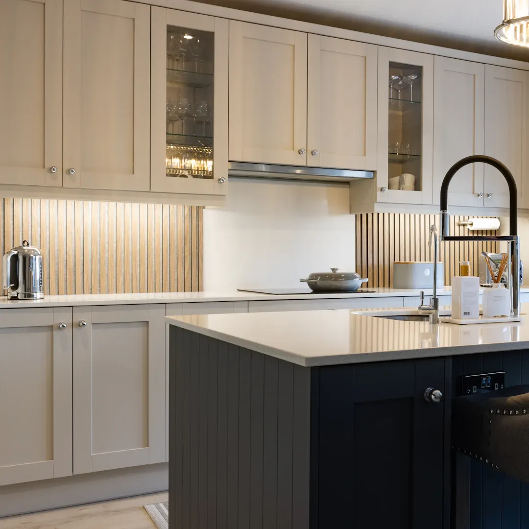
- A colored island. Navy, green or wood on the island with neutral perimeter cabinets.
- Wood and paint. Natural oak or walnut uppers with painted lowers, or the reverse.
- Accent zones. A coffee bar, butler's pantry or bar area in a bolder color.
These strategies also make future changes easier. Repainting an island is a much smaller job than refinishing an entire kitchen.
How to Test a Cabinet Color the Right Way
Screens and small paint chips are poor predictors. Here is a better process:
- Get a real door sample in the actual finish, not just a paint swatch.
- Place it vertically in the kitchen where the cabinets will go.
- View it in morning, midday, afternoon and evening light, with your lights on and off.
- Hold it next to your countertop sample, flooring and hardware.
- Look at it for several days before deciding.
We bring real samples to every in-home consultation so you can see color and wood species in your own light. For ideas that age gracefully, see our post on sustainable cabinet color schemes that age well.
Bathrooms, Laundry Rooms and Built-Ins
Color logic carries into other rooms. Bathrooms often have less natural light, so lighter vanity colors or warm wood can keep them from feeling cramped, while deep colors look striking in a powder room where you spend little time. Laundry rooms are a good place to try a cheerful or bold color because the stakes are low. Built-ins in living areas usually look best when they match or closely relate to the trim color so they read as part of the architecture.
Choose a Color You Can Live With
Cabinet color psychology is real enough to take seriously and loose enough that you should not let it decide for you. Focus on light, contrast, wear and how the color fits the rest of your home, then test it with real samples in your own space.
If you would like help choosing colors and finishes for new cabinets or a remodel, book a free in-home estimate or call (281) 660-3903. We will bring door samples to your home, talk through your light and finishes, and give you a written estimate for the work.
Frequently asked questions
Does cabinet color really change how a kitchen feels?
What cabinet color hides wear best?
Should I worry about my cabinet color going out of style?
How should I test a cabinet color before committing?
Planning a project like this?
Get a free in-home estimate from the team that builds and installs the work.